Client
PwC

Overview
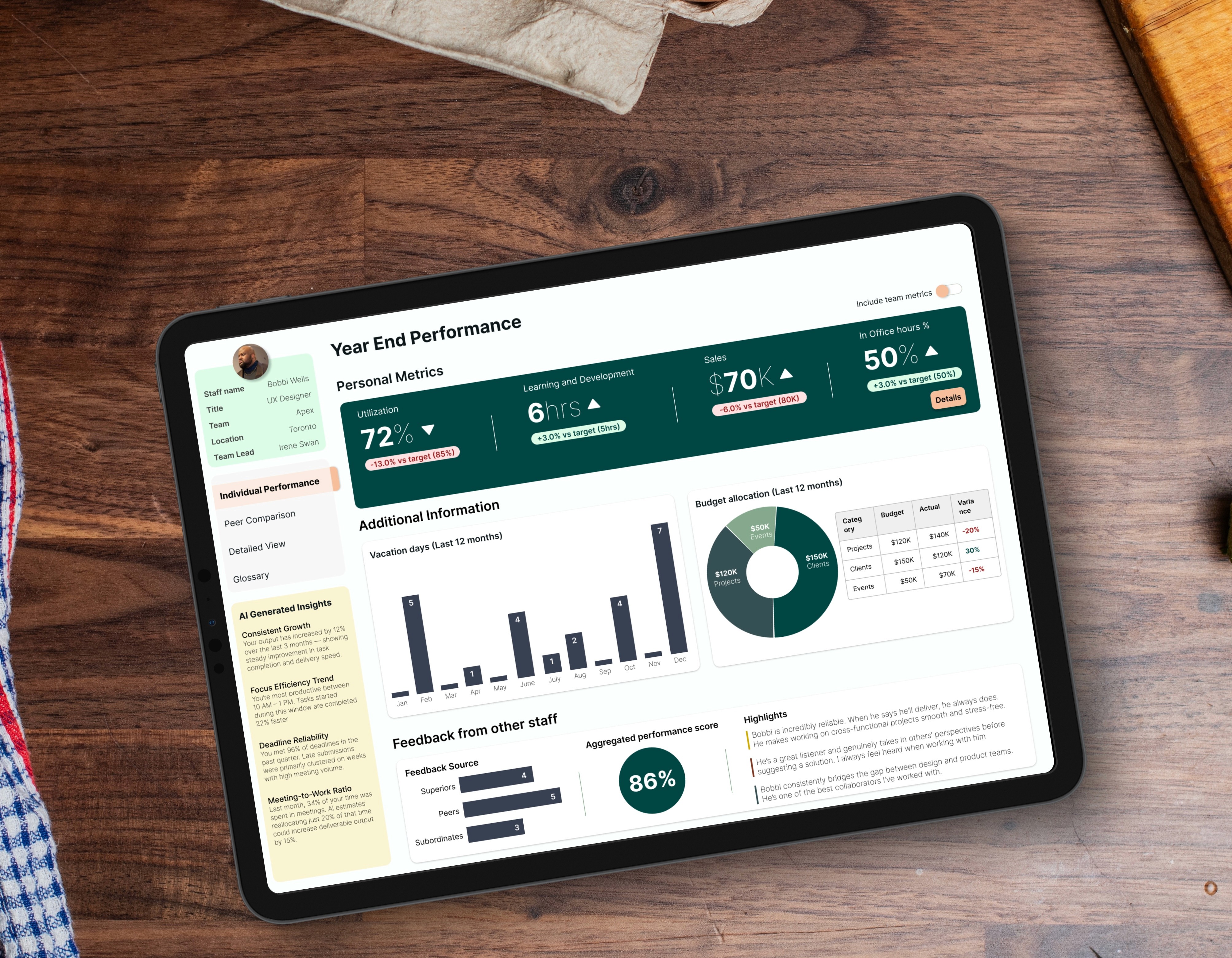
Consulting partners are brilliant at their jobs, but they absolutely hate administrative work. I designed a comprehensive Partner Operations ecosystem to give them a single, centralized hub for their entire workflow. The platform was deliberately split into two main areas: Performance, for tracking their individual targets, and Operational, for running the actual machinery of the business. This case study focuses on the crown jewel of the Operational side: the billing and collections module. By turning a clunky, frustrating legacy system into a fast, automated triage center, I helped partners track their unbilled time, collect overdue payments faster, and significantly boost the firm's cash flow. Note: All data is dummy, and the design has been tweaked to protect PwC Intellectual Property.
Client
PwC
Industry
Consulting
Service
UI/UX Design
Dashboard Visualization
Digital Design
Duration
4 months

The Problem
Here is the raw reality partners faced: to manage their lead to cash lifecycle, they had to bounce between multiple disconnected systems. It was a nightmare of fragmented data. When it came time to collect money, the system just dumped thousands of client records into massive, confusing spreadsheets. As you can see in the image below, the cognitive load was severe. This is not just a frustrating user experience; it is a massive business liability. Because the software was so painful to navigate, partners simply procrastinated on invoicing. Work sat unbilled for weeks, and unpaid invoices stretched past ninety days. The firm had millions of dollars trapped in the system simply because the billing UX was actively working against the people trying to use it.

My Approach
As the sole designer on this project, I could not just start pushing pixels. I had to understand the human friction and the business mechanics before ever opening Figma. Here is how I broke down the complexity. Human Insight via Empathy Mapping: I sat down with partners to understand their daily reality. The empathy maps revealed that they were feeling completely overwhelmed and even guilty about their administrative procrastination. This validated my core thesis that the new system needed to do the heavy lifting. The Lead to Cash User Journey: I mapped out their entire workflow outside of the software, which you can see in the visual below. By plotting their emotional state across the business lifecycle, it became undeniably clear that the legacy billing process was the absolute lowest point of their day. Invoicing could not live in an isolated silo; it had to be fixed.

The Solution and Impact
The final platform elegantly managed the entire business ecosystem without cluttering the screen. Since the complete interface is visible at the top of this case study, I want to use this final section to break down the exact structural and UI decisions that made it successful. You can view the specific architecture and annotated execution in the visual gallery below. The Structural Blueprint: As shown in the first gallery image, the absolute foundation of this success was the Information Architecture. Before designing any interfaces, I completely restructured the system data. I divided the legacy chaos into Performance and Operational pillars, and drilled deep into the billing hierarchy to map out the exact data structures needed for the matrix and ledgers. The NIDO Lockup Matrix: Displayed in the second gallery image, I replaced standard reporting charts with a visual heatmap matrix. By applying strict traffic lighting logic, the ninety day default buckets glowed stark red, instantly warning the partner of severe financial lockup risk. Actionable Triage: Displayed in the final gallery image, I added highly focused data tables directly below the matrix. This allowed a partner to spot a red flag in the top heat map and immediately click down to trigger a collection email workflow. The Impact: We completely changed how partners behaved. By removing the administrative friction and automatically highlighting exactly who owed them money, the dashboard stopped being just a reporting page and became an active, urgent revenue recovery engine. It saved partners hours of administrative headaches and got the firm paid significantly faster.


PORTFOLIO
PwC: Staff Portal Redesign
PwC: Staff Portal Redesign
PwC: Staff Portal Redesign

UI / UX Design
Data Visualization
Digital Design
Bespoke Metrics: Subcontractor Experience Design
Bespoke Metrics: Subcontractor Experience Design
Bespoke Metrics: Subcontractor Experience Design
User Research
Experience Design
Digital Design