Client
PwC
Overview
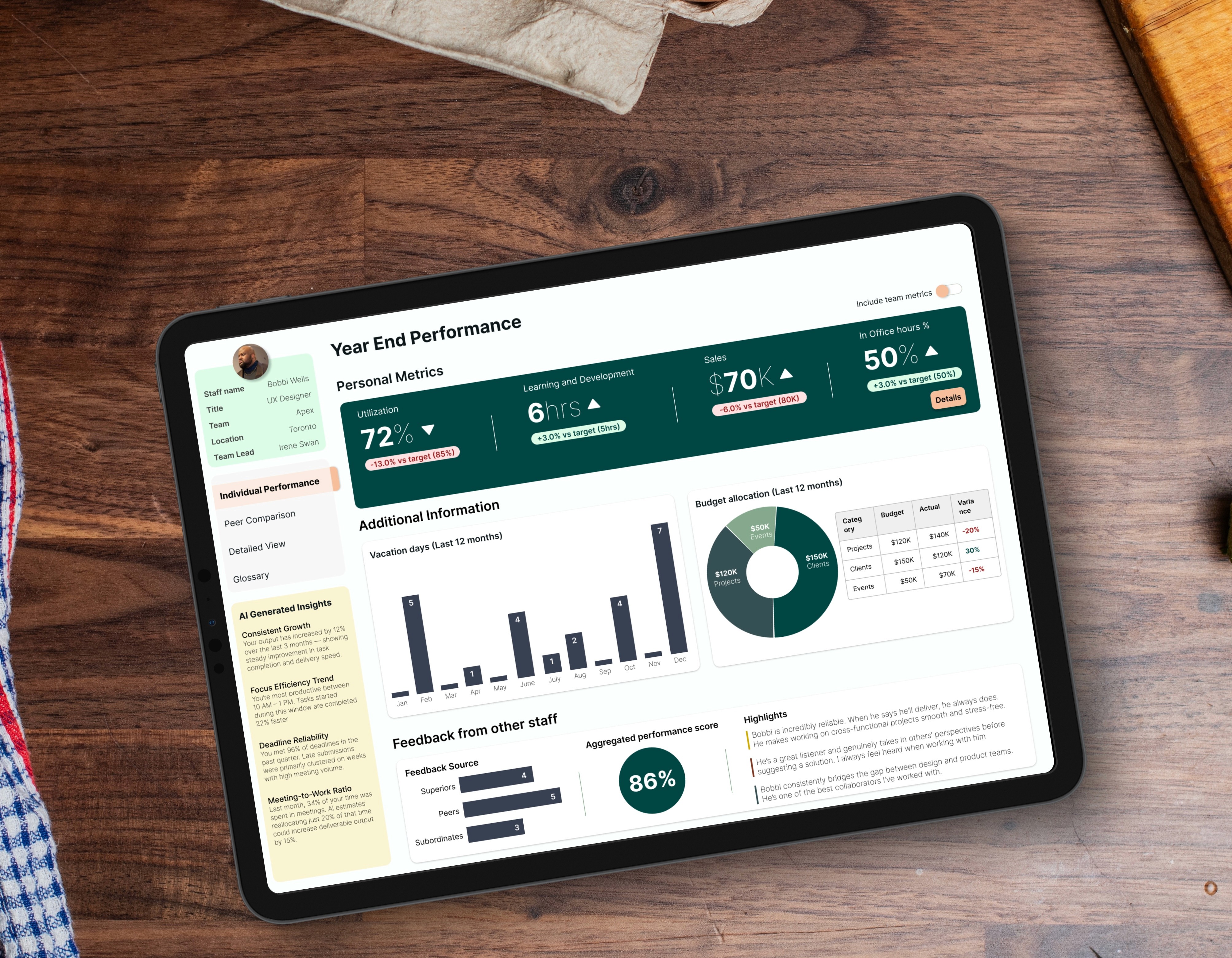
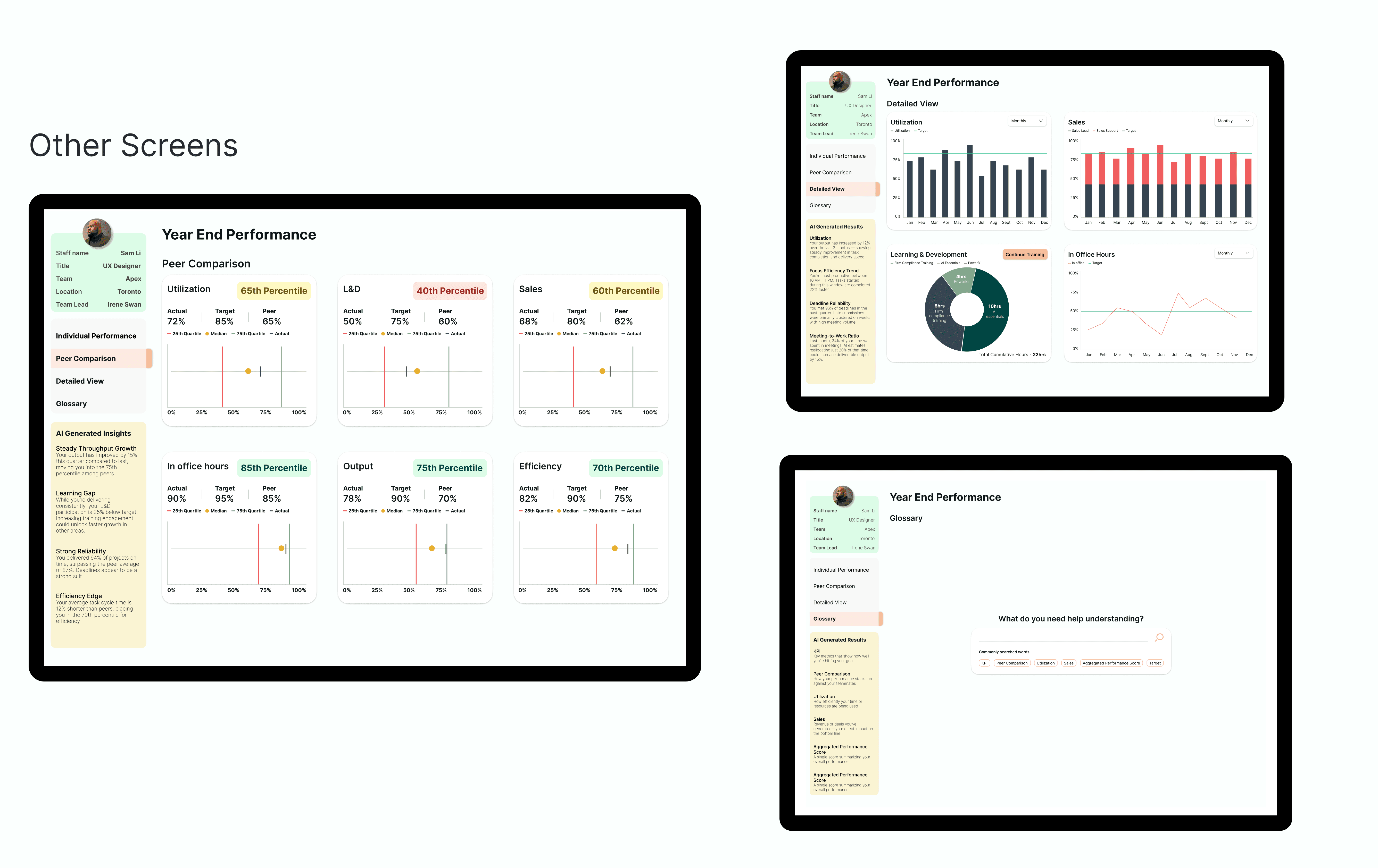
PwC Canada’s staff platform is used daily by thousands of employees. Over time, the dashboard had become cluttered and visually inconsistent, slowing people down instead of helping them start their day. I was responsible for redesigning the dashboard to make it clearer, more modern and easier for staff to track their performance metrics, wellbeing, baseline firm expectations and feedback progress. Note: All data is dummy, and the design has been tweaked to protect PwC Intellectual Property.
Client
PwC
Industry
Consulting
Service
UI / UX Design
Data Visualization
Digital Design
Duration
3 years

The Problem
The original dashboard tried to show everything at once, which made priority tasks hard to spot. Legacy patterns, mixed styles and competing elements created visual noise, and newer staff often felt lost because the interface lacked hierarchy. The experience worked, but it demanded more effort than it should.

My Approach
I ran a lean process while working within internal constraints. I began with a focused group study to interview users of the previous platform and understand their pain points and frustrations, where things broke, why they stopped using the platform, and most importantly, what would make them go back to using it. I also mapped out their typical journey when using the legacy dashboard to validate and visualize their pain points. I explored layout options that clarified the structure without disrupting existing systems, and refreshed the UI with cleaner spacing, modern colours and a consistent design language. We further confirmed these pain points by analyzing app usage metrics (30 day period). Total Views: Uniquer Viewers Ratio: In the old design, our Stickiness Ratio was 1.4. This means for a total views of 140, we were getting unique viewers of 100. This means users were 'bouncing.' They opened the report once a month, likely just to grab one number for a meeting, and never came back. Error Rate (Slicer Resets): We analyzed that users were constantly clearing filters or clicking "Undo," in their interactions. This meant they were or confused or making mistakes. A high "reset rate means the mental model of the dashboard was too complex. Load Speed: Because everything was on a single page, load times were slow, and users definitely left before anything was achieved, or they left frustrated.The goal was simple: reduce friction and make the dashboard instantly understandable.

The Solution and Impact
The redesigned dashboard is clearer, calmer and far easier to scan. Key tools surface naturally, the visual hierarchy guides attention and the updated look brings a modern, unified feel. Stakeholders responded strongly to the improvement in clarity, and teams found it noticeably easier to navigate their core tasks. Even without sharing internal metrics, the feedback made it clear that the redesign restored focus and efficiency to a heavily used internal entry point.


PORTFOLIO

PWC: MANAGE PROFITABILITY
PWC: MANAGE PROFITABILITY
PWC: MANAGE PROFITABILITY

UI/UX Design
Dashboard Visualization
Digital Design
BESPOKE METRICS: SUBCONTRACTOR EXPERIENCE DESIGN
BESPOKE METRICS: SUBCONTRACTOR EXPERIENCE DESIGN
BESPOKE METRICS: SUBCONTRACTOR EXPERIENCE DESIGN
User Research
Experience Design
Digital Design