Client
PwC

Overview
The Manage Profitability dashboard is a critical enterprise financial tool used by senior leadership across the firm. The platform tracks massive amounts of financial data, down to the individual partner level, and transforms it into a clear, actionable narrative that empowers executives to make faster, smarter business decisions. This case study is honest about the process, including the moment it got turned upside down mid-way through, and what that taught me about designing in the real world. Note: All data is dummy and the design has been tweaked to protect PwC intellectual property.
Client
PwC
Industry
Financial
Service
UI/UX Design
Dashboard Visualization
Digital Design
Duration
4 months

The Problem
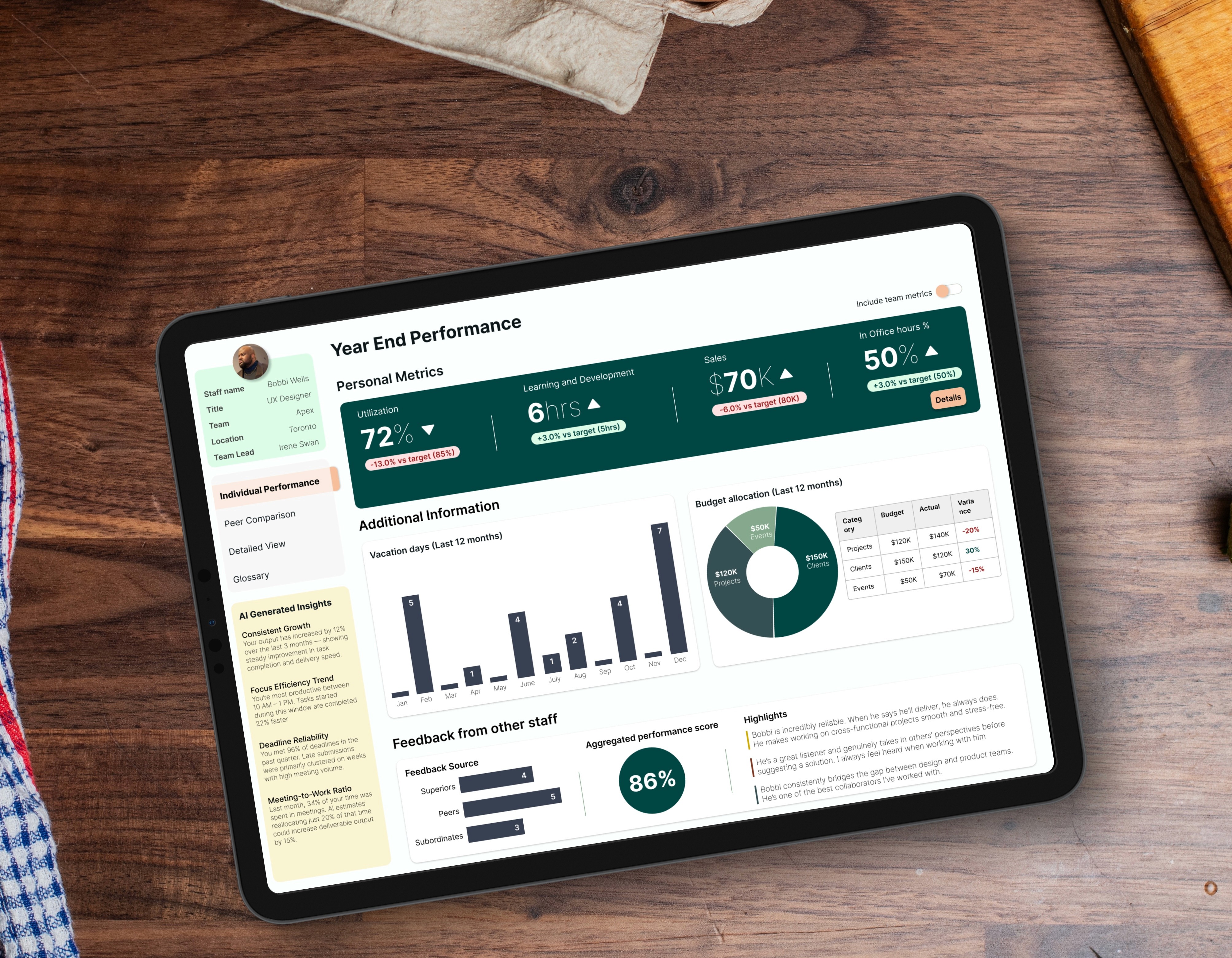
There was no centralized view of the firm's financial health. Pulling together a profitability report meant cross-referencing spreadsheets, manual exports from iPower and Salesforce, and waiting on analysts. By the time the data was ready, it was already outdated. The problem wasn't a bad dashboard. There was simply nothing there at all. Two Users, One System Two completely different people needed to live in this dashboard. Richard Sterling, Managing Partner Needs the 30,000 foot view in 60 seconds. Opens his laptop before a Monday meeting and needs to know if the firm is on track. No time to dig. No patience for complexity. Marcus Webb, Business Unit Head A power user who needs to go three levels deeper. The top-level numbers tell him something is wrong. He needs the dashboard to tell him exactly where and why. These two users, with completely different needs in the same system, became the foundation of every design decision.

My Approach
I started with stakeholder interviews, empathy mapping, and journey mapping. Mid-research, my manager halted everything. He had caught wind of a stakeholder meeting in Vancouver with all the key decision-makers in one room. He needed hi-fi mockups in days to fly out and get project buy-in. I dropped the process and built a convincing proof of concept fast enough for him to get on a plane. He came back with a yes, and two concrete asks from the stakeholders: a Default Outlook timeframe and a Year-over-Year Profitability Bridge. Both became central to the final design. After Vancouver we went back to the beginning properly. Second persona, full IA, role-level permissions, and a complete dev handoff. Where AI Showed Up Copilot for prototype data Stakeholder reviews kept derailing because the dummy numbers looked fake. I built a custom Copilot agent to generate logically consistent financial data for every mockup. Reviews completely changed. People stopped questioning the math and started evaluating the design. Saved me three to four hours per cycle. Cursor connected to the design system We connected our design system directly to Cursor so engineers had a live copy of every component without opening Figma dev mode. Design stayed consistent from file to code and back-and-forth questions dropped noticeably. Iteration, not assumption Three core decisions came directly from stakeholder and manager review cycles, not from the initial design. Default Outlook toggle: MTD and YTD alone did not tell leaders how this affected plan. Default Outlook indicated overall health of projected profitability Secondary context metrics: Switching timeframes used to hide prior values, so users lost their reference point and kept re-checking. Now unselected timeframes stay visible as secondary text, removing that memory tax. YoY Profitability Bridge: A single variance number told stakeholders something changed but not why. The bridge breaks the change into named drivers, isolating the actual cause.

The Solution and Impact
Five card KPI layout Net Revenue, Gross Margin, Contribution Margin, CM per Partner, CM per Share. Everything Richard needs in one scan. Timeframe toggle with persistent context The selected timeframe drives the hero metric. Unselected timeframes stay visible as secondary text below each card. No short-term memory required. Default Outlook The Vancouver ask. Executives needed to see where the firm was projected to land, not just where it had been. Semantic traffic lighting Green is good. Red needs attention. WCAG 2.1 AA compliant. Problems announce themselves. YoY Profitability Bridge The second Vancouver ask. A waterfall chart that breaks down exactly what drove margin changes year over year. Rate increases, volume growth, overhead costs, resource drag. The why is always visible. Top and Bottom Performers Business units ranked by contribution margin. Immediate accountability without digging. The Detailed View for Marcus One button from the main dashboard takes Marcus into a deeper layer of the same product. Condensed KPI bar scoped to his BU, engagement profitability table, partner contribution cards, team utilization breakdown, and a 12-month billable hours trend. Same visual language throughout. What Richard gets in 60 seconds, Marcus can verify in 20 minutes. Impact 5 documents consolidated into 1. 3 days to insight reduced to instant. Lessons Learned The Vancouver trip produced two features that made the product better. But I got lucky. We were showing a vision before we fully understood the problem. Next time I would build a structured alignment session at the start specifically to get rough stakeholder buy-in early, so a surprise meeting never derails the research phase.


PORTFOLIO
BESPOKE METRICS: SUBCONTRACTOR EXPERIENCE DESIGN
BESPOKE METRICS: SUBCONTRACTOR EXPERIENCE DESIGN
BESPOKE METRICS: SUBCONTRACTOR EXPERIENCE DESIGN

User Research
Experience Design
Digital Design
PWC: STAFF PORTAL REDESIGN
PWC: STAFF PORTAL REDESIGN
PWC: STAFF PORTAL REDESIGN
UI / UX Design
Data Visualization
Digital Design